2018
Role
Product Designer
Services
Web
joany
Joany was a local, Los Angeles-based startup on a mission to make it easier for everyone to find and manage their health insurance, by offering concierge services and advocacy for their customers as well as tools to make comparing and applying for insurance easier to understand and successfully complete.
I was one of two designers who worked with engineering, product and research on the user experience and design for a 0-1 product.
As a company, they have dissolved since my time there.
Problem
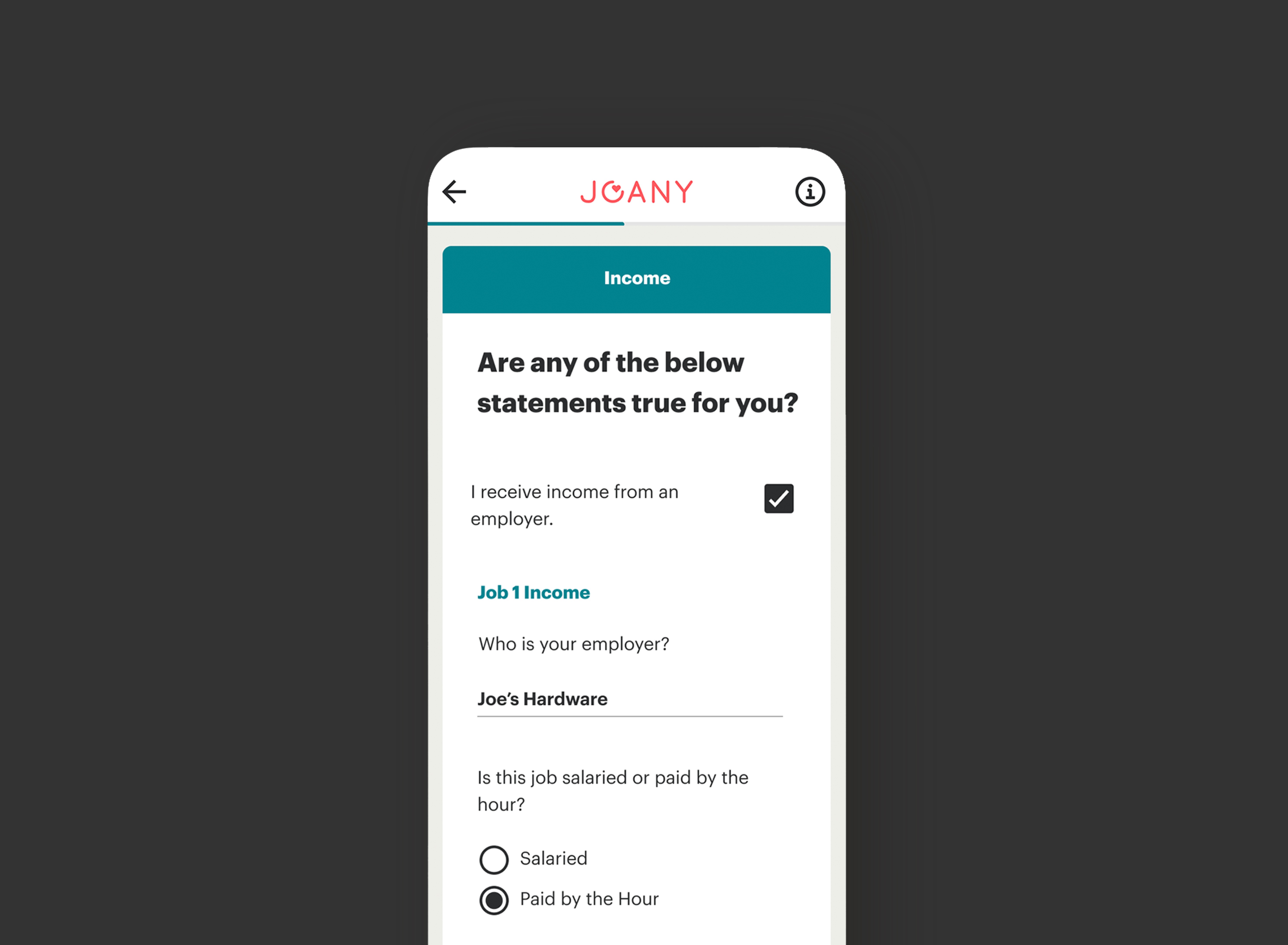
As the lead designer on the health insurance application flow, I was first tasked with architecting and designing an experience that allowed users to easily apply to Covered California online (before that service was provided by Covered California itself).
During this flow, users could ultimately opt into allowing Joany to be their authorized representative or health insurance broker, thus completion of the application and conversion rate were both measures of success.
Process
The flow that allows JOANY users to apply for health insurance through their website was architected by dissecting the paper application form, analyzing its redundancies and odd ways of chunking or explaining information and finally redesigned to solve for all these confusing and tedious pain points. It was an extensive exercise in information architecture, content hierarchy and overall UX design, executed within the parameters of the brand and the UI library of components.
Outcome
Good design is impossible without empathy for the end-user. In the case of JOANY and in the matter of health insurance, good design must go further. It must show respect for the user’s time, budget, privacy and well-being.
In an industry otherwise bereft of respect in these regards, this is what our design team strove to deliver in every facet of the experience, despite missteps elsewhere in the business.


