2017-2018
Role
Sr. Experience Designer, R/GA
Services
Web
Converse
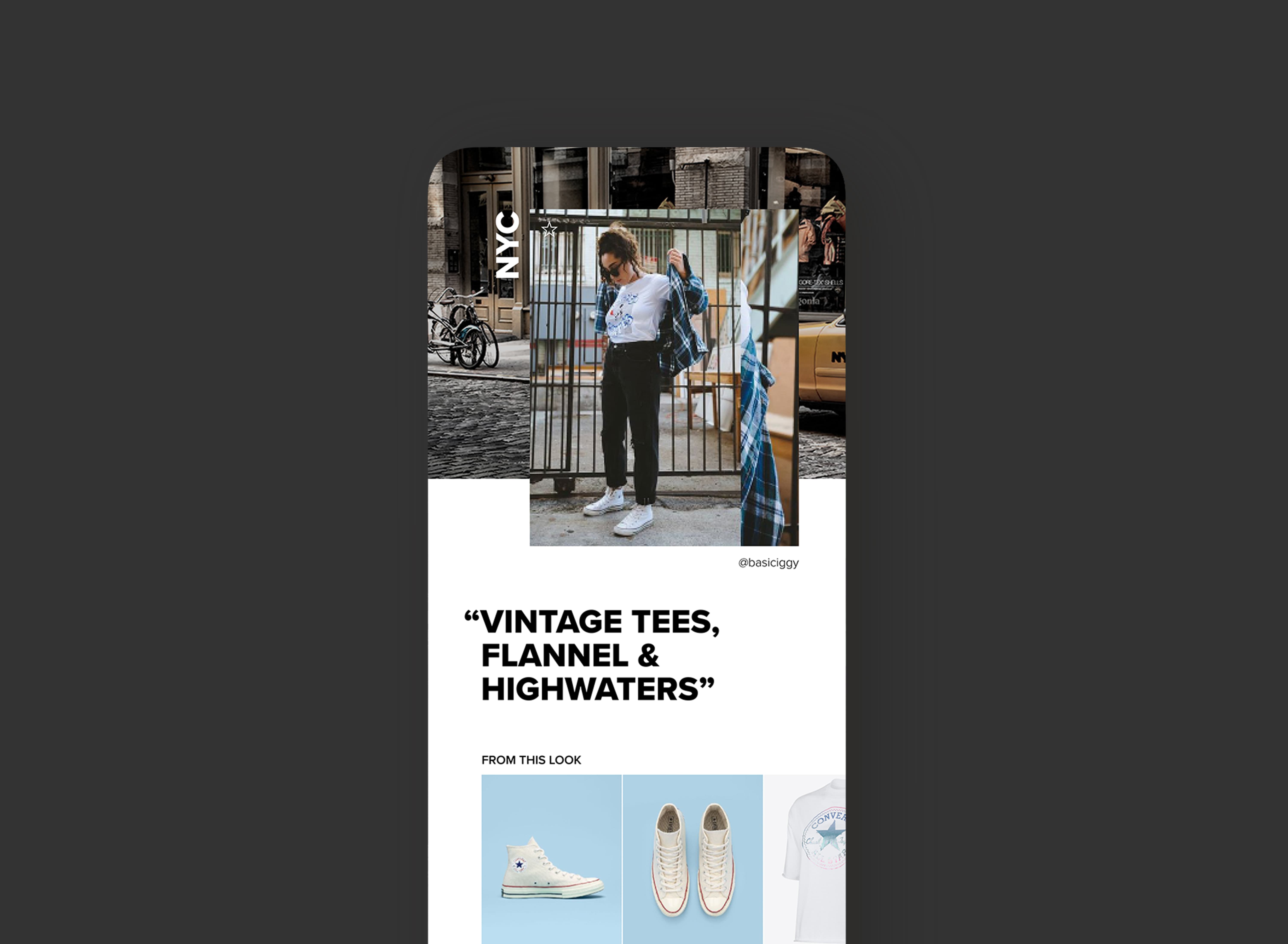
More than a destination, Converse.com is a platform for dialogue and collaboration—one that allows for effortless shopping while enabling discovery and cultivating relationships. A new site that better aligns with the brand vision: one as authentic, youthful, and daring as the people who champion it.
This global makeover is the result of a 16 month-immersion, working side by side with the Converse design team from idea to execution.
I was one of three lead experience designers (who had the privilege of working with all those awesome team members—a lot, I know) responsible for the full redesign and re-platforming of Converse.com for the North America and EMEA markets launched in 2019.
Problem
During my time at R/GA, we were asked to:
Design the first and best expression of the Converse brand and the most personal connection to the customer.
Create the pinnacle of product storytelling.
Enable a world class service experience.
Also move the entire site off the Nike platform and onto Salesforce Commerce Cloud and rethink everything and fast. NBD.
Process
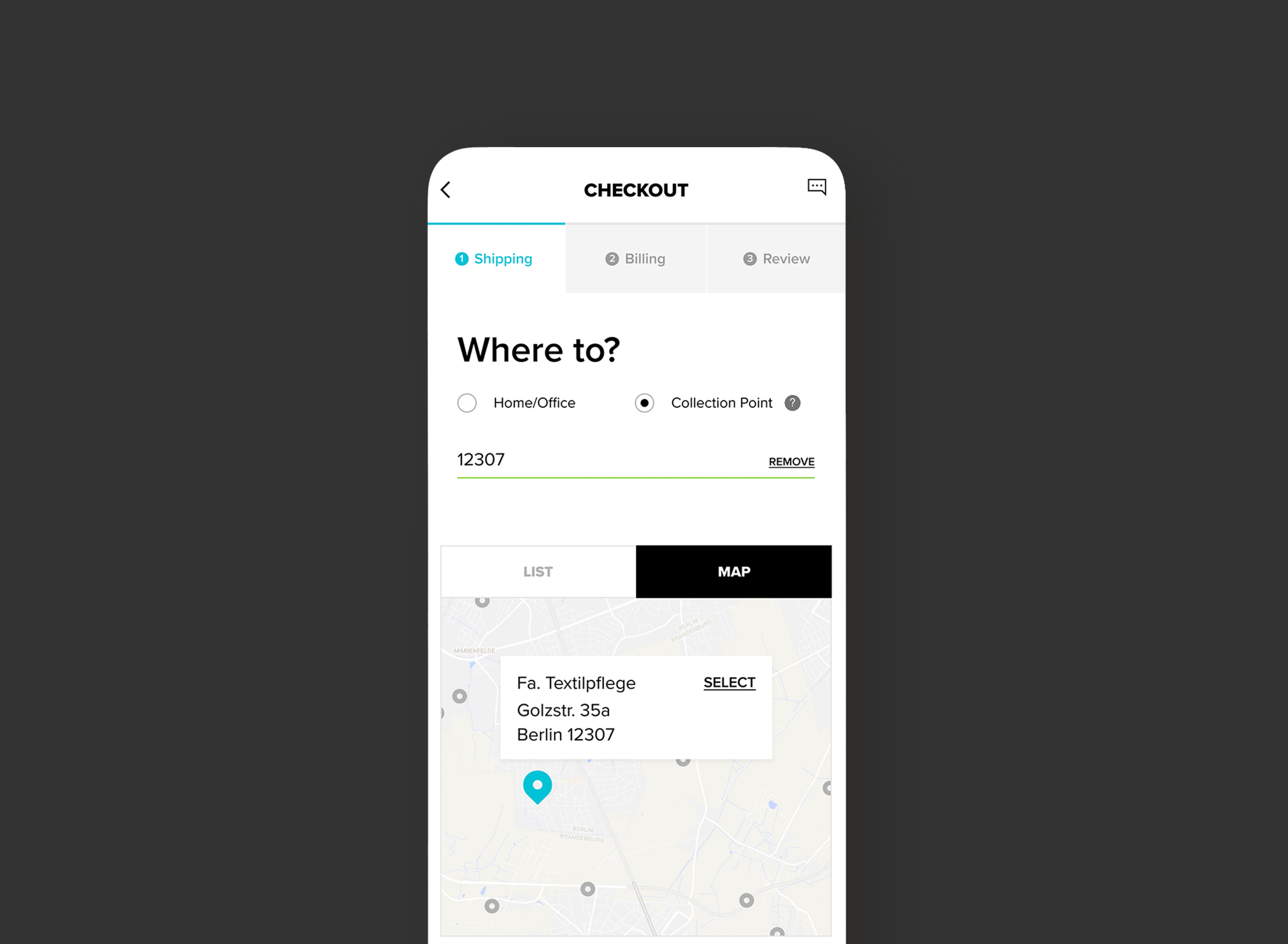
As an experience design lead, I was responsible for content strategy and interaction design across several key feature areas such as the Gridwall/Product Listing Page, Navigation, Checkout, Account, and more—creating a new Converse.com that provides shoes and clothes that let me be the realest version of myself and curated content that shows me how.
Outcome
We strategically created a seamless, social-first shopping platform and experience where customers and Converse fans can buy their favorites, discover new ones, and engage with the brand in a whole new way.


